

Why you need the options Profit/Loss diagram?
Thank you guys for your continued support, we've received a lot of comments and feedbacks from different places regarding Options Analysis tool, here we would like to make a detailed introduction on the Combination P/L analysis particularly, because it's the most useful one when trading options combinations and we've spent great deal of time developing it and will continue to make it better.
As we all know, if you trade stock, your returns are linear with the stock price move. However, options returns are not necessarily linear with the stock. Especially when you trade a spread or combination of options, it can be difficult to understand all your potential profits and losses. You would have to aggregate the profits and losses at each stock price point for each option. This would be an extremely tedious task and is unreasonable.
A Profit/Loss diagram can help you visualize your risk and rewards at different stock prices at expiration. This allows you to see how much you can potenitally make or lose for different stock outcomes.
Therefore, we use a graphically generated Profit/Loss diagram in the Options Analysis page to quickly show you the profit or loss you would have at various stock price points.
Here is today's Options Montage report which monitored market data and provides a snapshot of noteworthy changes in stock and option volumes. From the "Options expected to have increasing volume" list, Apple will probably be a nice pick (which just released blowout Q3 earnings with sales up 11% and a 4-1 stock split by August).
So lets say we have a strangle option from July 31 in $Apple(AAPL.US$ with 28 days to go until expiration.
Note: A long strangle is that investors simultaneously buys an out-of-the-money call and an out-of-the-money put option. The call option's strike price is higher than the underlying asset's current market price, while the put has a strike price that is lower than the asset's market price.
Look at the diagram below generated by moomoo options analysis tool for this strategy. The diagram will show you your profit and loss on the vertical axis at the various stock prices on the horizontal axis.
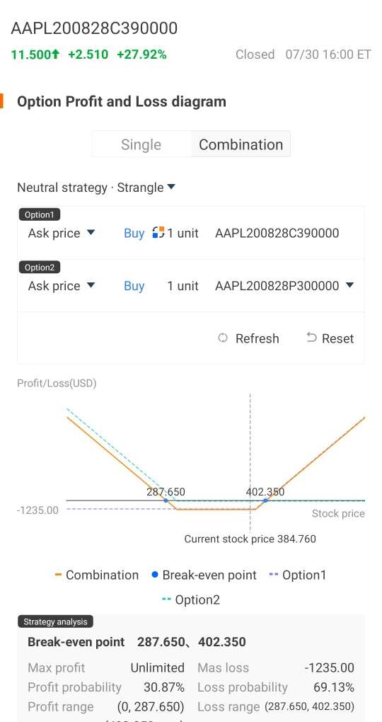
The breakeven point is when the stock price is at $287.65 or $402.35. If the stock goes above $402.35 or below $287.65 you would start making money and your maximum profit is unlimited (and you would start to lose money if the stock price goes between the two break-even point).
And your maximum loss would be limited to the premium paid for the two options. As you can see, this is a quick and easy visual way to determine your different payouts at various stock prices, without having to do the tedious calculations yourself.
Below is the full introduction to the options analysis tools, and there is options depth quote giveaway at the end of the article, will be ended up by July 31, give it a try and leave comment, we appreciate any feedbacks and ideas you provide!

Disclaimer: Moomoo Technologies Inc. is providing this content for information and educational use only.
Read more


Comment
Sign in to post a comment

Moomoo Community Official Account
We are here to provide product info.
123KFollowers
249Following
28KVisitors
Follow
curtaincall : Wow thanks for mentioning. This is a great feature moomoo provides almost everything free this is my No 1 platform

Shring : MooMoo is the Best
treydongui curtaincall: right on man. exactly. not to mention... do you know of an exchange with longer hours. that was my first big initial pull. You did kill that analysis tho @curtaincall